CYBRA Branding Guide.
Developed as a means to maintain design and branding consistency, the marketing and design team at CYBRA is excited to share this branding guide to our customers, partners, and employees. We hope you find our branding guideline helpful and enlightening.
Voice
CYBRA was founded in 1985 and is a leader in radio-frequency identification (RFID) and barcode technology. As a software brand in a specialized industry, CYBRA’s copy and messaging needs to be articulate and descriptive. While we value clarity and technical expertise in our writing, CYBRA’s written voice is also smart, punchy, clever, and positive.
CYBRA Content and Copy IS
- Authoritative: Our content will be assertive and should provide expert thought leadership in the RFID and barcode industry. Readers should feel confident in our expertise and impressed by our product capabilities.
- Positive: Content will motivate and encourage our users to grow their business with our software. It should hold a positive tone and avoid negativity.
- Contemporary: As the market evolves, our content should stay updated on the latest trends and cover topics in the present.
- Clever: the voice of our content should be clever, funny yet professional and engaging with our readers.
CYBRA Content and Copy IS NOT:
- Dry: While content will have a confident tone, it should deliver information in the most engaging manner possible. Avoid being dry, sterile or using excessive industry jargon.
- Overly-opinionated: Content should avoid providing opinions over facts.
- Absolute: Content will avoid using terms like “never,” “always,” and “forever.” It should not make any claims that our services will guarantee landing a job.
- Unsure/Indirect: Content will not make unclear or broad statements. Content will be confident in tone and direct and include a call to action.
All Content and Copy Should Be:
- Urgent: Why is the problem urgent for your audience?
- Unique: Why is the CYBRA model unique?
- Useful: Why is this a must-have solution for your audience?
- Ultra-Specific: How does the product work, specifically?
- User-Friendly: Why should your audience say yes to your service, today?
- Unquestionable Proof: Why should your audience trust you?
General Best Practices
- Wherever possible, content and copy should reference scientific or policy documents pertinent to our audiences.
- Write enticing headlines and subheads that are to the point and never vague.
- Use subheads liberally; they increase scannability.
- Avoid passive voice in favor of active voice whenever possible.
- Write clear sentences and paragraphs.
- Offer clarity over cleverness.
Logo Usage Best Practices
- Do not add shadows or gradients to logos.
- Do not change the colors of logos.
- Do not add additional wording or imagery to logos.
- Do not stretch or distort logos' dimensions.
- Provide ample spacing around the logo.
CYBRA Corporate Logo
CYBRRA’s corporate logo honors the legacy of the company. Originally a software recommendation service, CYBRA’s original tagline was “your oasis for software support”, hence the palm tree motif. Over the years the company has morphed into specializing in auto-ID technology. We kept the palm tree as an homage to the past, but got a new tagline that suits us a little better – we identify with success.
Approved Variations
The horizontal logo design is the preferred branding style. However, when appropriate, the logo can be adjusted to accommodate for space and/or style. When the logo is on a dark background, the first priority is visibility. Switch the logo and type to all white. Otherwise, never alter the logo's original colors.
Vertical
No Text
Dark Background
MarkMagic Logo
CYBRA’s MarkMagic barcode labeling software logo is an icon with an abstract barcode in the shape of the letter “M”. Additionally, the logo utilizes the same Overpass font as the corporate logo and elsewhere in the company’s branding.
Approved Variations
The horizontal logo design is the preferred branding style. However, when appropriate, the logo can be adjusted to accommodate for space and/or style. When the logo is on a dark background, the first priority is visibility. Switch the logo and type to all white. Otherwise, never alter the logo's original colors.
Vertical
No Text
Dark Background
Edgefinity IoT Logo
CYBRA’s Edgefinity IoT RFID software logo is an icon with an abstract letter “E” to coincide with the MarkMagic icon. Additionally, the logo utilizes the same Overpass font as the corporate logo and elsewhere in the company’s branding.
Approved Variations
The horizontal logo design is the preferred branding style. However, when appropriate, the logo can be adjusted to accommodate for space and/or style. When the logo is on a dark background, the first priority is visibility. Switch the logo and type to all white. Otherwise, never alter the logo's original colors.
Vertical
No Text
Dark Background
Imagery
At CYBRA we endeavor to clearly articulate our solutions and products. By using expressive imagery, we can better describe our products and services.
Imagery Usage Best Practices
- Do not distort, combine, add colors to, or modify existing images.
- Do not layer or combine multiple images on top of one another.
- Provide ample spacing around images.
- Do not use abstract iconography.
Icons
For several reasons icons are great visual tools that can balance out text on a site or application. They can enhance one’s brand by incorporating a color palette while retaining white space and avoiding unnecessary clutter. CYBRA utilizes outlined icons on CYBRA.com and in other forms of media.


Illustrations
Using illustrations is an eye-catching way to convey product features and services that may not be possible with photographs or screenshots. CYBRA utilizes illustrations based on the open source project - unDraw.


Photography
Adding photography to media adds important context and depth. Photography used in CYBRA's media should capture the spirit and essence of its solutions and products. All photography for CYBRA's media should be bright, vibrant, and illustrative.


Typography
The desired effect of CYBRA's font choices are openness, familiarity, and readability. The fonts used in all of CYBRA's media are open source, with its two main fonts available on Google Fonts. Additionally, these fonts are widely used online as well in real life to promote a feeling of familiarity. Lastly, CYBRA's fonts are chosen to ensure high readability and to maintain web accessibility standards.
Typography Usage Best Practices
- Do not use all caps or title case.
- Do not use more than 1 type of emphasis at a time.
- Do not crowd a small space with a lot of text or eliminate a margin to create space for text.
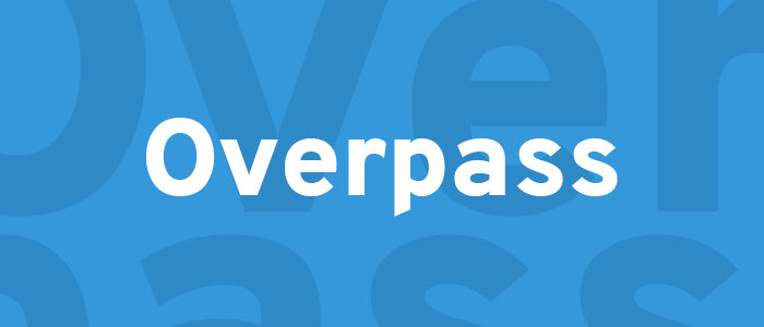
CYBRA’s main display font is Overpass. This is the open source version of the Highway Gothic, which was originally used on U.S. highway and road signs across the country. Overpass features 20 styles, including thin, light, light italic, regular, regular italic, semi-bold, bold, extra bold, and black.
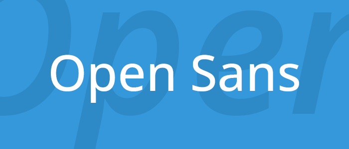
Open Sans is the body copy font used on CYBRA.com, and in other forms of media. Open Sans is an open source humanist sans-serif typeface commissioned by Google in 2011. It is an extremely popular font used on more than 20 million websites worldwide.
Colors
CYBRA.com and its media deploys a warm and diverse color palette that accommodates for the many industries and solutions CYBRA is in.
Color Usage Best Practices
- Do not use colors together that vibrate or have low contrast.
- Do not use strong colors (red, orange, etc) as backgrounds.
- Do not use a tint or shade of red as the main accent color.
#1abc9c
#2980b9
#9b59b6
#f39c12
#ecf0f1
#16a085
#3498db
#8e44ad
#f1c40f
#bdc3c7
#2ecc71
#2c3e50
#c0392b
#d35400
#95a5a6
#27ae60
#34495e
#e74c3c
#e67e22
#7f8c8d